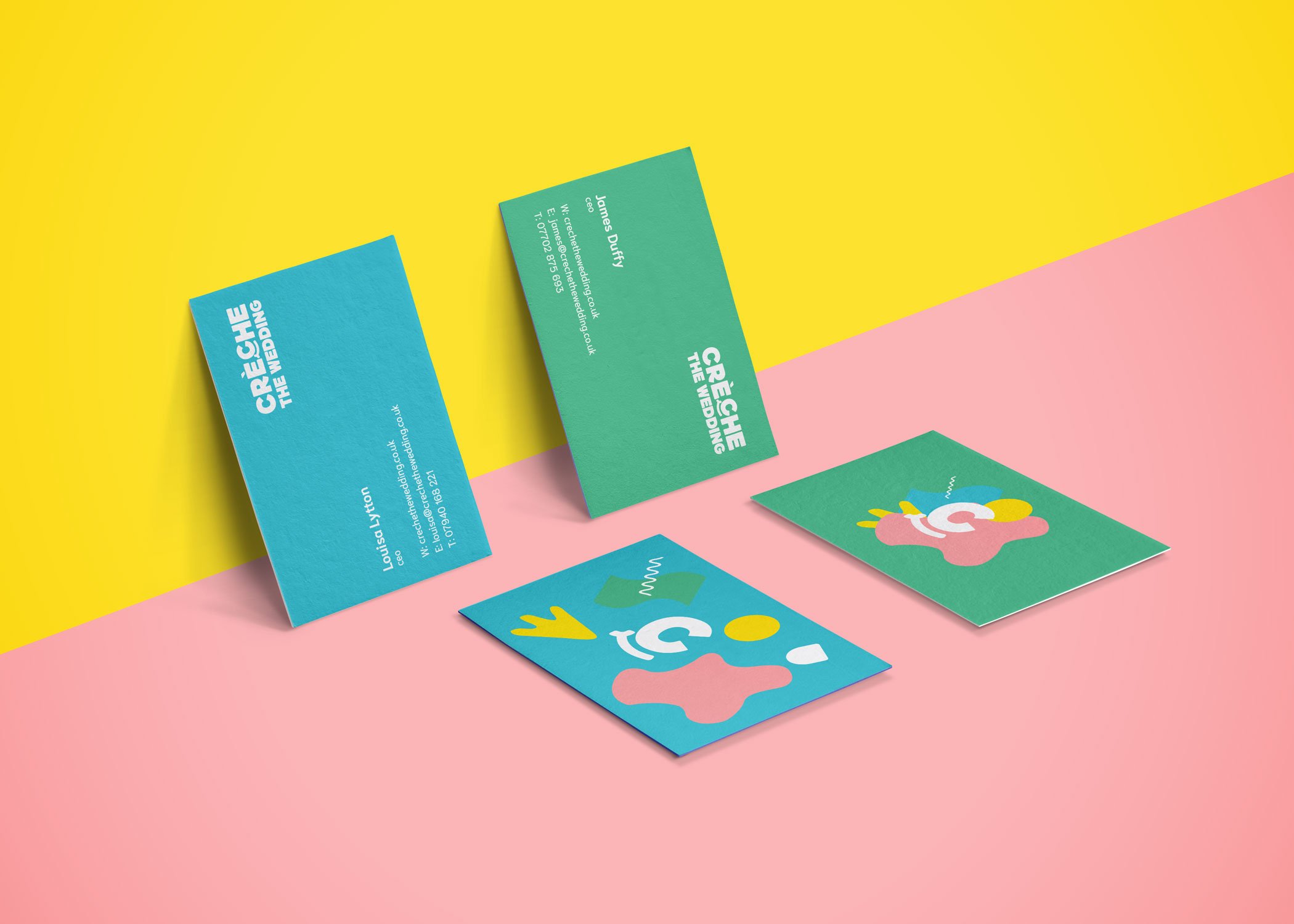
Creche the Wedding

Creche Course in Wedding Perfection – Creche the Wedding

Four colourful business cards are displayed on a pink and yellow background, highlighting a strategically‑led branding studio. The cards feature green designs with white text and abstract, playful shapes in pink, yellow, and blue.

Weddings are meant to be joyful celebrations. But for parents with young children, they can become a source of stress rather than celebration. How do you enjoy your best friend’s big day when you’re constantly worried about your toddler’s meltdown during the vows? Creche the Wedding saw this problem and decided to solve it. They needed a brand that would convince parents to trust them with their most precious cargo while reassuring couples that professional childcare could elevate their wedding experience.

A turquoise van with colourful abstract shapes and the words "CRÈCHE THE WEDDING" on its side is parked by a street, reflecting the spirit of a strategically‑led branding studio. Two tall palm trees and a blue fence stand out under a clear sky.
A colourful paper cup with abstract shapes and a letter "C" design floats above a green surface against a teal background, symbolising Growth by Design and scalable growth strategies for start-ups.

The wedding childcare market was fragmented and unprofessional. Most providers looked like they’d been cobbled together by someone’s cousin who “likes kids.” Parents needed to feel confident about leaving their children with strangers, while couples needed to believe that on-site childcare would enhance, not detract from, their special day. The challenge was threefold: establish trust with parents, demonstrate value to couples, and create a brand that appealed to both adults and children without looking childish or unprofessional.

Two colourful gift cards with abstract shapes rest on a pink background. The teal cards feature “Gift Card” in white, symbolising scalable growth strategies for start-ups and the creative spirit of Growth by Design.

We built Creche the Wedding from the ground up, creating a brand that was professional enough for parents and magical enough for children. The visual identity centered on bespoke illustrated patterns that felt like sophisticated children’s artwork – the kind of drawings a talented child might create, but elevated and refined. These patterns, combined with a custom wordmark and typeface, created a system that was both playful and trustworthy. We developed a comprehensive suite of touchpoints: packaging design that felt like unwrapping a gift, van artwork that made the service feel established and professional, out-of-home advertising that caught attention without being juvenile, and a website that converted worried parents into confident customers. The tone of voice balanced warmth with professionalism, speaking to parents’ concerns while highlighting the joy and peace of mind the service provided.

The new brand helped Creche The Wedding secure listings 100s of venues