Grey Matters

Positioning Gray Matters – The Business Development Studio That Masters Positioning

A website section titled “How we do it…” features four illustrated icons with descriptions about brand purpose, leadership culture, marketing strategy, and target profile—highlighting Growth by Design—all set on a teal background with brain patterns.

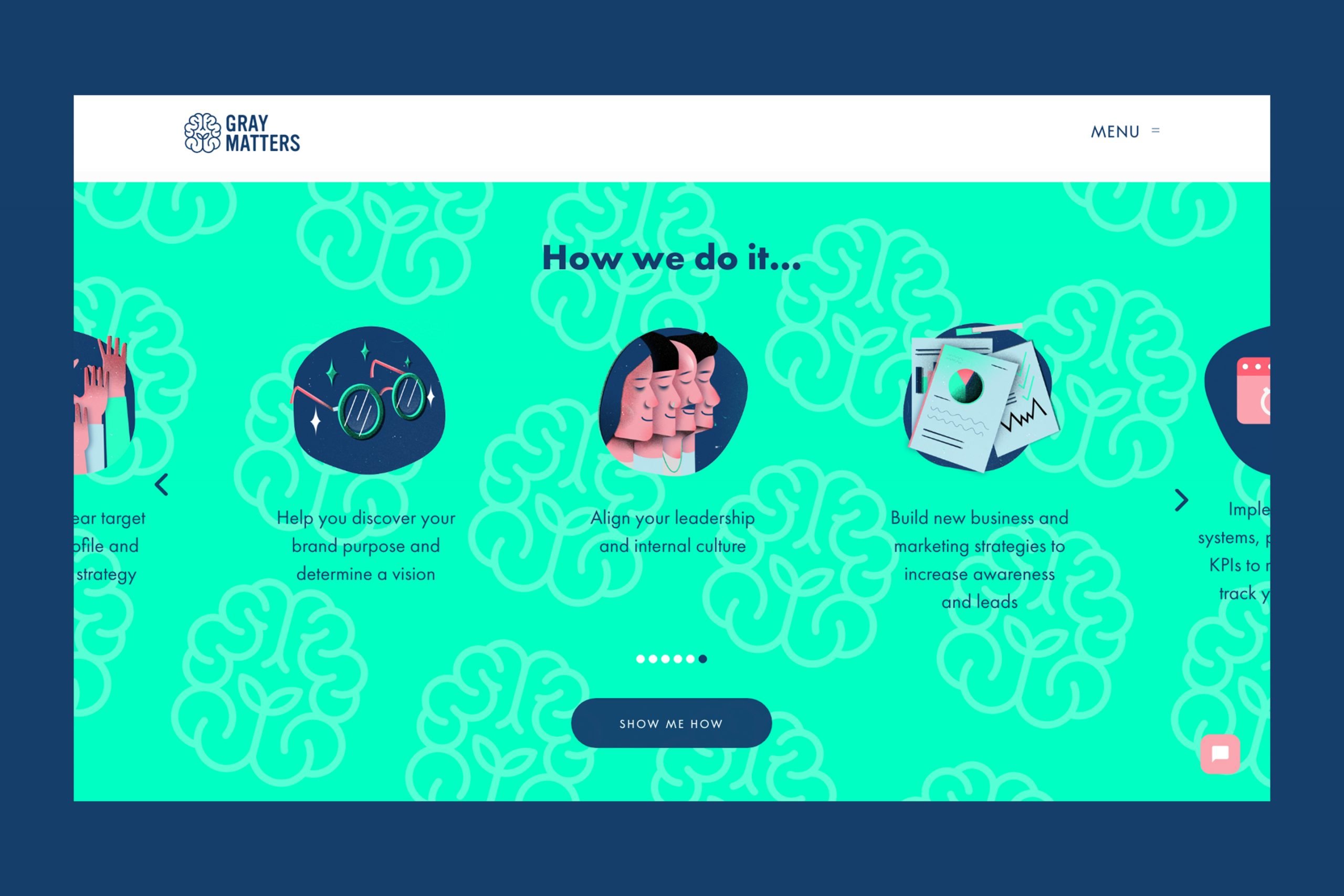
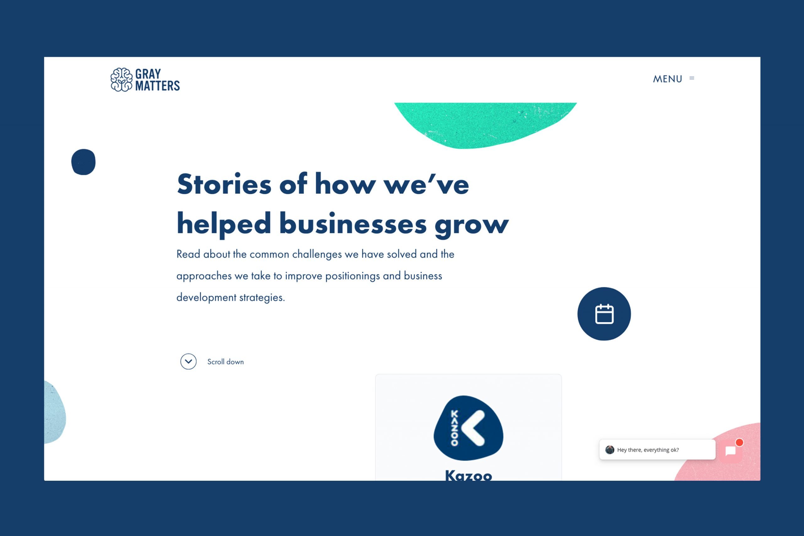
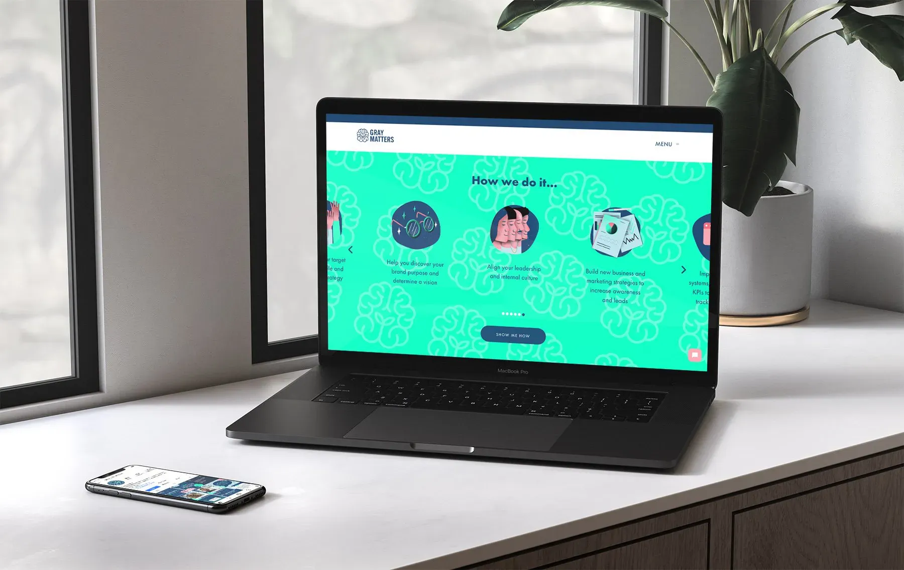
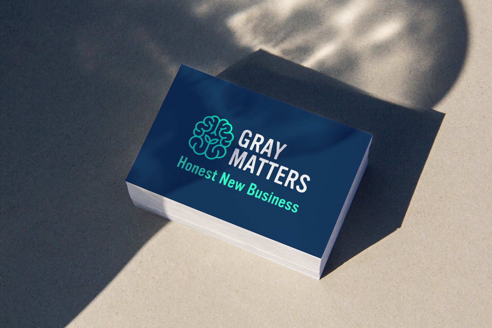
Grey Matters is a pioneering brain health conference that brings together leading neuroscientists, psychologists, and mental health professionals to explore the frontiers of brain science and its applications. When the organisers approached us, they needed a brand identity that would reflect the conference’s innovative spirit while making complex neurological concepts accessible and engaging to a diverse audience.

A website page for Grey Matters showcasing business growth stories and scalable growth strategies for start-ups, featuring bold headline text, a navigation menu, and abstract colourful shapes on a white background with a blue border.
A black laptop displaying a colourful website with brain illustrations sits on a white desk near a window; next to it, a mobile phone rests—showcasing the work of a strategically-led branding studio focused on scalable growth strategies for start-ups.

The primary challenge was creating a brand identity for Grey Matters that would bridge the gap between scientific rigor and public accessibility. The conference needed to appeal to both academic professionals and the general public interested in brain health. Additionally, the visual system had to be versatile enough to work across multiple platforms—from digital media to physical conference materials—while conveying the sophisticated yet approachable nature of the event.

A stack of business cards on a light surface. The top card, by a strategically‑led branding studio, features a blue background, brain-shaped logo, and the text "GREY MATTERS" and "Honest New Business" in white and light green.

We began by immersing ourselves in neuroscience imagery and concepts, exploring the visual language of brain mapping, neural networks, and cognitive functions. This research phase informed our development of a distinctive visual identity centered around an abstract brain motif composed of interconnected geometric shapes and flowing lines. The colour palette was carefully considered: we selected a core combination of cool greys complemented by vibrant accent colours that represent different areas of brain function and research. This balance of understated professionalism and dynamic energy perfectly captured the conference’s essence. Typography was selected for clarity and contemporary feel, with a clean sans-serif for headers and body text that maintained legibility across all applications. We developed a comprehensive system of icons and graphic elements representing various brain functions and neurological concepts, creating a cohesive visual language that could be applied across all touchpoints. For the conference materials, we designed a modular system that allowed for easy adaptation across different formats—from the website and social media to programs, badges, and environmental graphics for the physical space. Each application maintained the core brand elements while adapting to its specific context.

30% increase in client onboarding