Kingsland University

Rewriting the Rules of Education – Kingsland University

A street billboard showcases blue and teal geometric posters with text promoting coding, blockchain fundamentals, and performance marketing courses—reflecting a creative that converts approach—against a graffiti-covered brick wall.

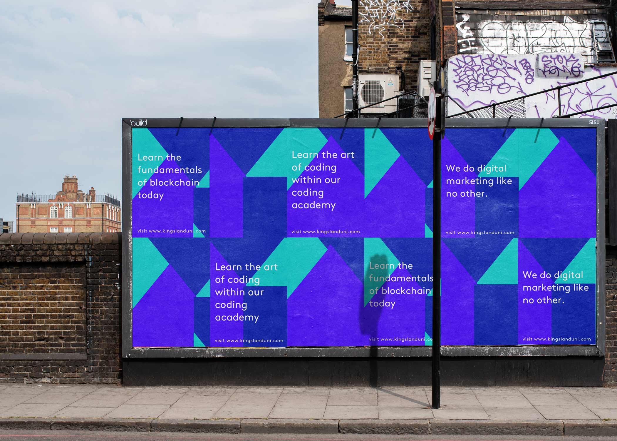
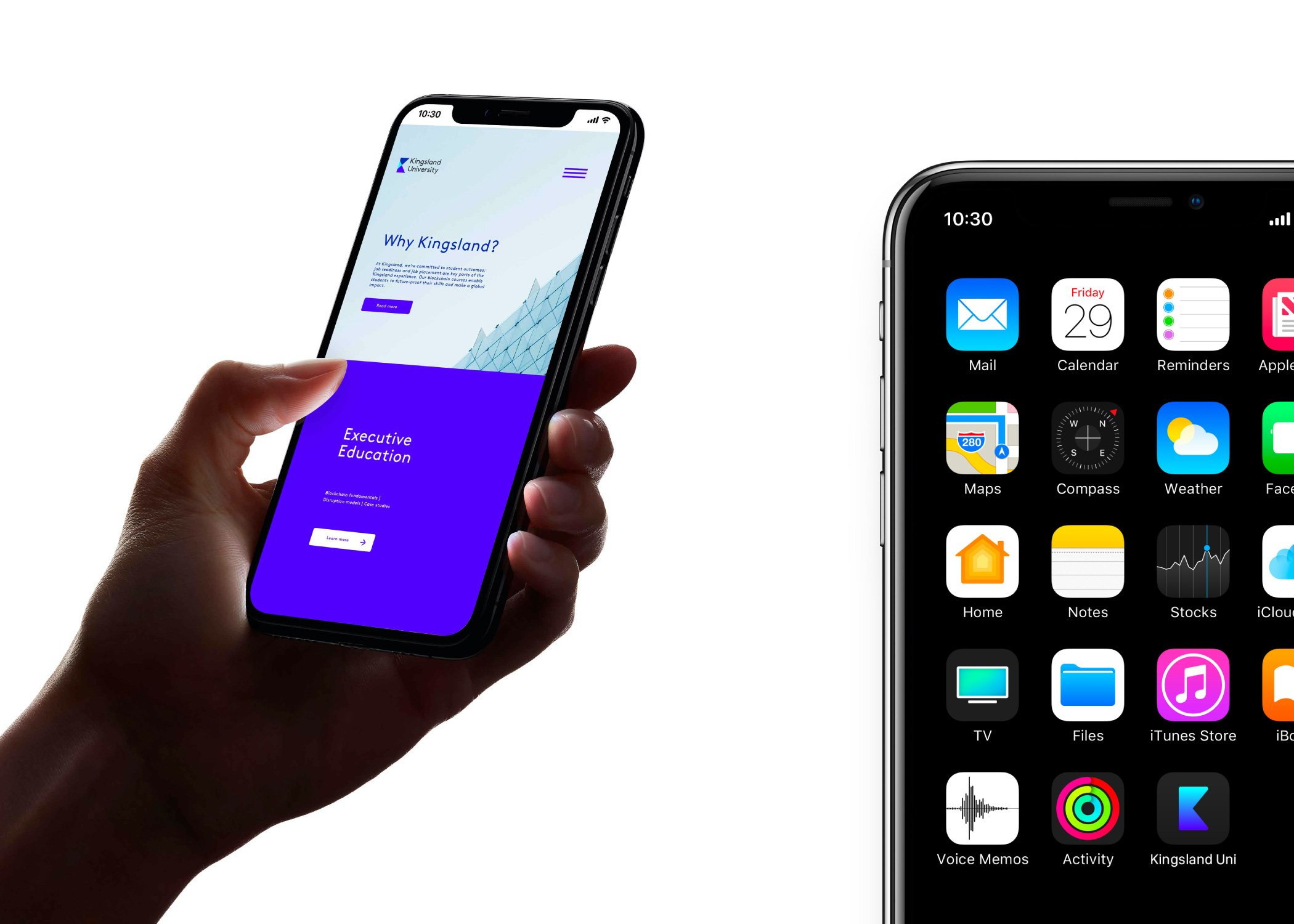
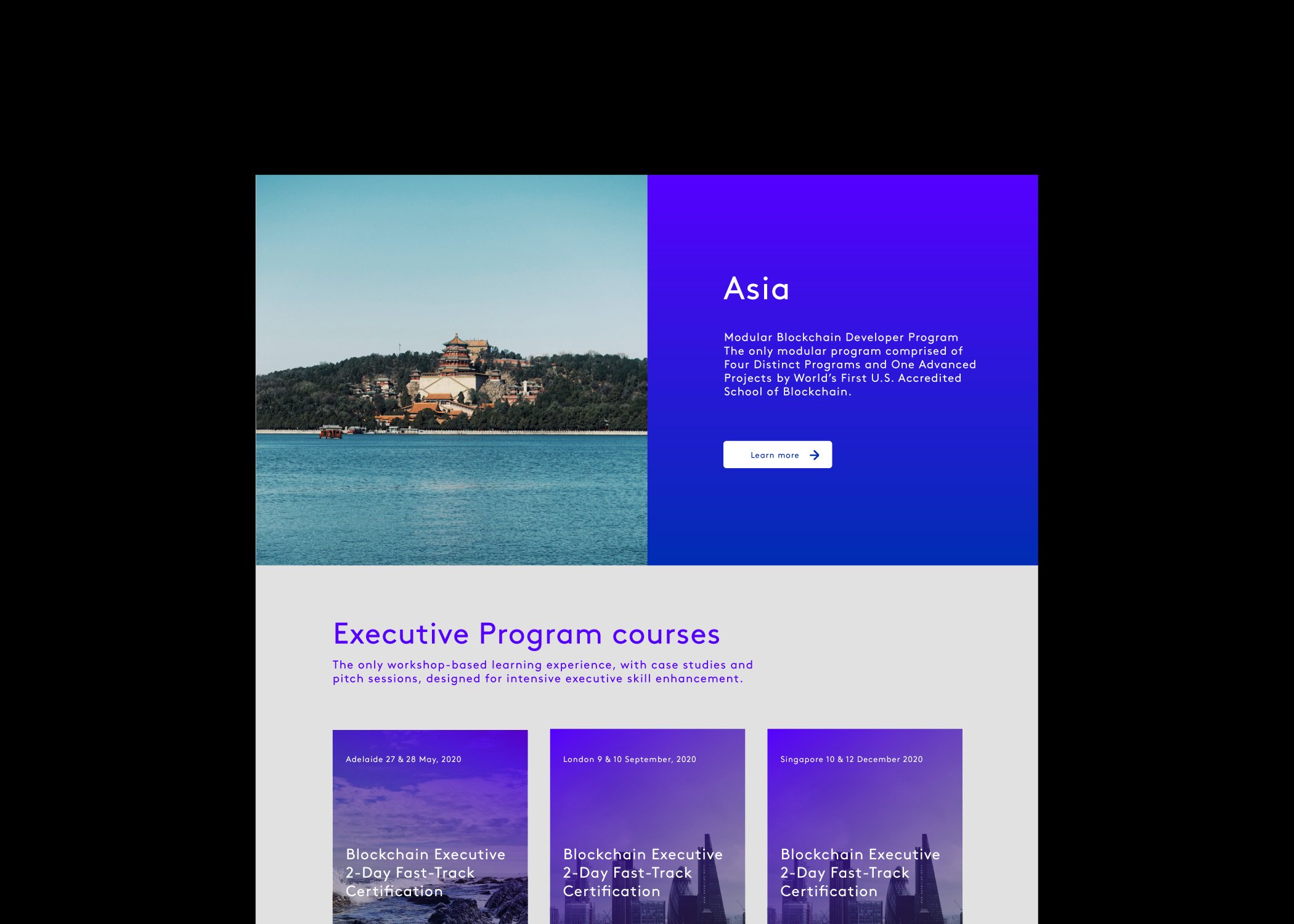
Traditional education is broken. Four years, six-figure debt, and a degree that’s obsolete before you graduate. Meanwhile, the tech industry is screaming for talent, offering life-changing salaries to people with the right skills. Kingsland University saw the disconnect and decided to build the bridge. They believed anyone should be able to access the most in-demand career fields regardless of their situation. No trust fund required. No decades of debt. Just intensive, practical education that delivers results. We worked with the founders from initial naming through full rollout to create a brand that would challenge everything people thought they knew about higher education.

A hand holds a smartphone displaying an executive education app with a purple and white interface, designed by Growth by Design. Next to it, another phone’s home screen shows various app icons.
A smartwatch, a button on denim, a blue cap, and a white water bottle—each branded with Kogland University’s geometric "K" logo—exemplify Growth by Design on vibrant blue backgrounds.

The education industry is built on prestige, tradition, and gatekeeping. Centuries-old institutions with ivy-covered walls and alumni networks that span generations. How do you convince people to trust a new model when the old one has such deep roots? The challenge wasn’t just competing with universities – it was competing with the entire cultural narrative around “proper” education. Parents who saved for decades to send their kids to college. Students who equated educational value with campus quads and graduation ceremonies. We needed to create a brand that looked legitimate without looking traditional. Something that commanded respect in boardrooms while appealing to people who’d been failed by the system. A visual identity that could work on LinkedIn profiles and job applications. The naming itself was crucial. “University” carried weight and credibility, but it also carried expectations. We had to deliver on the promise of that word while redefining what it could mean.

Screenshot of a website section for a blockchain developer programme in Asia, created by a strategically‑led branding studio. Features a lakeside temple photo, purple gradient info box, and course listings with dates and locations for growth by design.

We started with a fundamental truth: results matter more than reputation. The visual identity needed to feel established and authoritative without relying on academic clichés. No caps and gowns. No ancient Greek columns. Instead, we developed a brand system that spoke to the future of work, not the past of education. The approach was about empowerment through accessibility. Every touchpoint reinforced that this wasn’t education for the privileged few – it was career transformation for anyone willing to work for it. The visual language was modern, confident, and inclusive. We positioned Kingsland University not as an alternative to traditional education, but as the evolution of it. Not as a shortcut, but as a more direct route. Not as second-best, but as first-choice for people who prioritized outcomes over prestige. The tone of voice balanced aspiration with pragmatism. We spoke to people’s dreams while acknowledging their realities. Financial constraints weren’t obstacles to overcome – they were exactly why Kingsland existed. The brand successfully positioned intensive, practical education as not just viable, but superior for career-focused learning.

The new brand won accreditation through the Southern Association of Colleges and Schools resulting in a large spike in signups