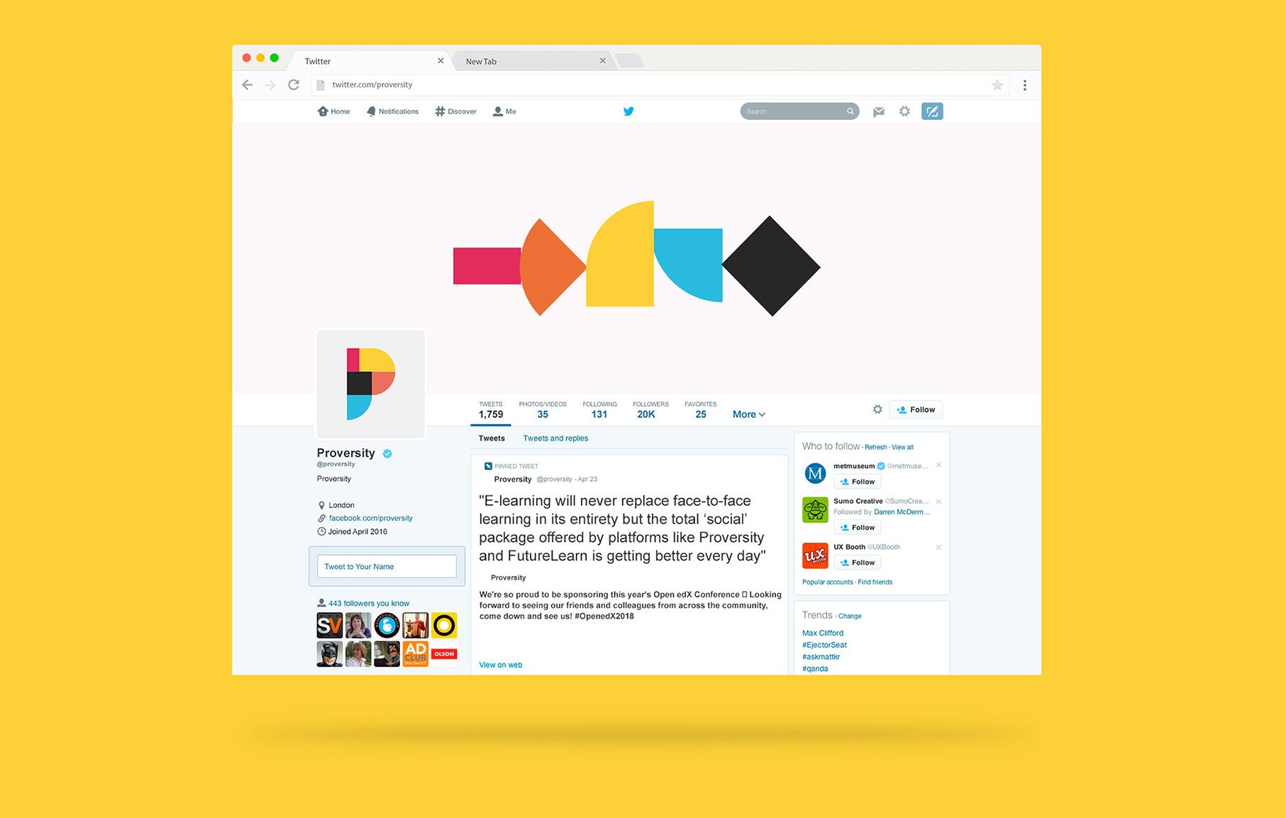
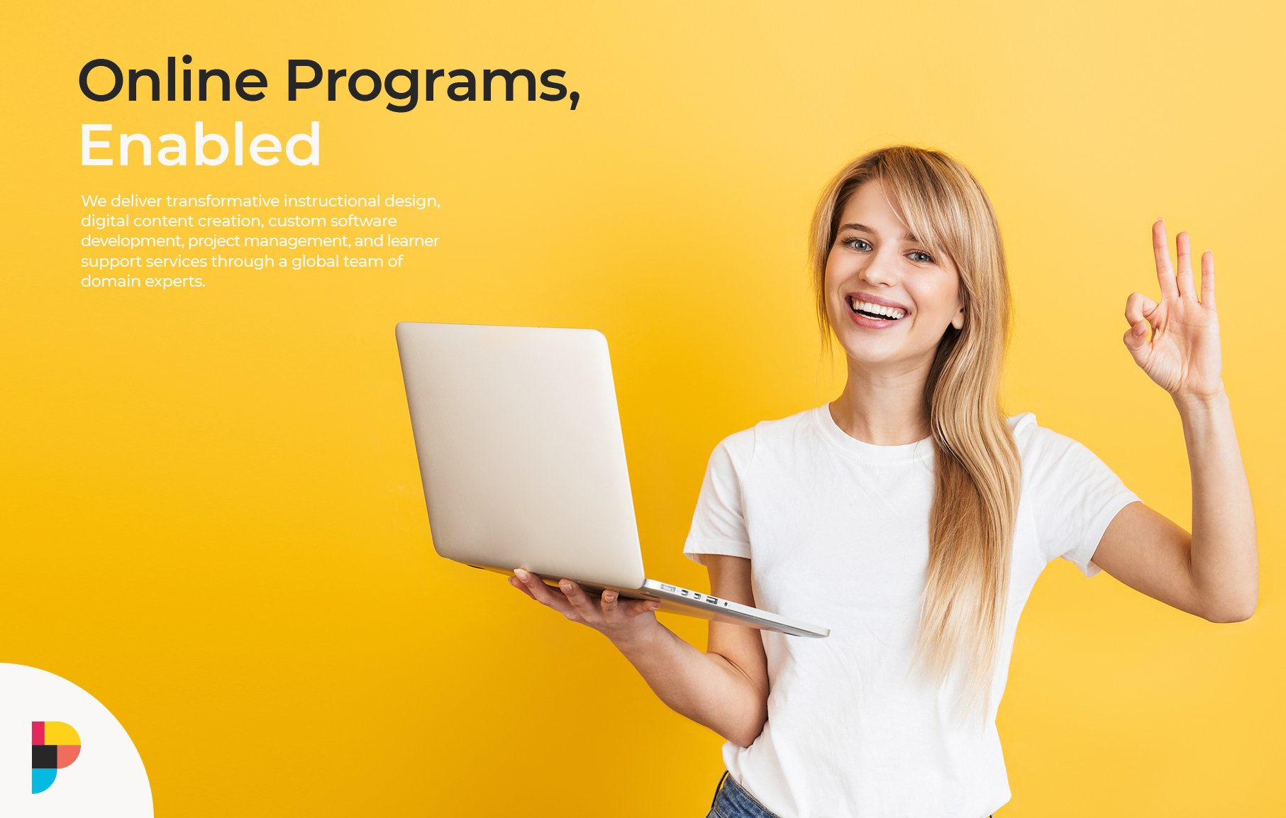
Proversity

Disrupting the Degree

A young woman with curly hair stands against a yellow background, smiling whilst using a tablet. Text on the left reads "Online Programmes, Enabled" by Growth by Design—a strategically‑led branding studio. A colourful logo is in the corner.

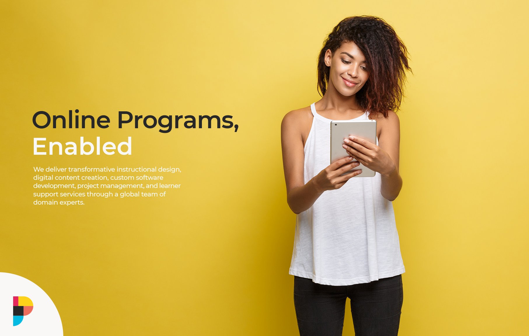
Proversity represents a new approach to professional education—combining the academic rigour of university coursework with practical, industry-relevant skills training. When this educational technology platform approached us, they needed a brand identity that would position them at the intersection of traditional education and forward-thinking professional development.

A smiling woman in a bright pink shirt types on a silver laptop against a light blue background. Text on the image promotes "Online Programmes, Enabled" and highlights scalable growth strategies for start-ups in digital educational services.
A computer screen displays the Twitter profile page of Proversity, a strategically‑led branding studio, featuring a colourful geometric logo and a tweet about e-learning. The background is solid yellow.

The educational technology space is highly competitive and rapidly evolving. Proversity needed to differentiate itself from both traditional universities and purely vocational training platforms, establishing credibility with employers and students alike. The brand needed to convey innovation and technological sophistication while maintaining the trustworthiness associated with established educational institutions.

A smiling woman in a white T-shirt holds a laptop in one hand and makes an “OK” gesture with the other. The yellow background features text promoting online programmes, services, and scalable growth strategies for start-ups.

We developed a comprehensive brand strategy centred around the concept of “progressive professionalism”—the idea that career development is an ongoing journey rather than a destination. This philosophy informed every aspect of the visual and verbal identity. The visual system began with a dynamic logo that combines a stylised “P” with forward-moving geometric elements, suggesting progress and advancement. The subtle gradient transitions in the mark represent the blend of academic foundation and practical application that defines the Proversity approach. We selected a colour palette anchored by a deep navy blue that conveys trust and professionalism, complemented by vibrant teal and amber accents that add energy and modernity. This combination helped position Proversity as both established and innovative. The typography system paired a distinctive, slightly angular sans-serif for headlines, conveying precision and forward thinking, with a highly readable serif for body text that nods to academic traditions while maintaining contemporary appeal. We created a flexible system of graphic elements inspired by data visualisation, learning pathways, and connection points, which could be applied across digital platforms, course materials, and marketing communications. This visual language reinforced the platform’s technological capabilities while maintaining a human-centred approach.

The new brand helped secure the acquisition by OES