Rebel Cookie

Rewriting the Recipe for Success

A geometric design with black, white, and yellow patterns features the bold text "REBEL COOKIE" in the centre, set against a yellow background on a solid purple backdrop—perfect for a Creative that Converts.

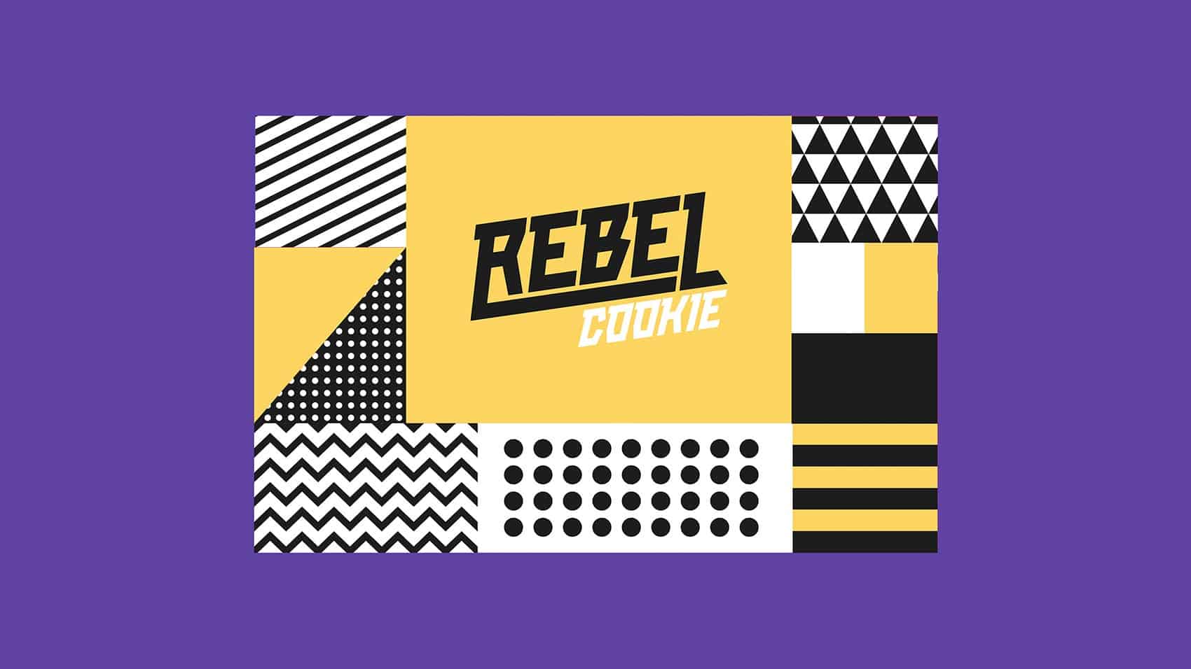
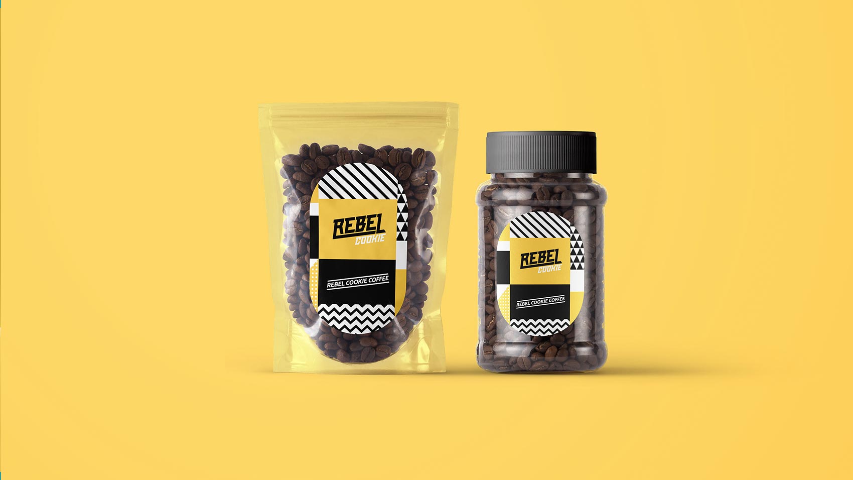
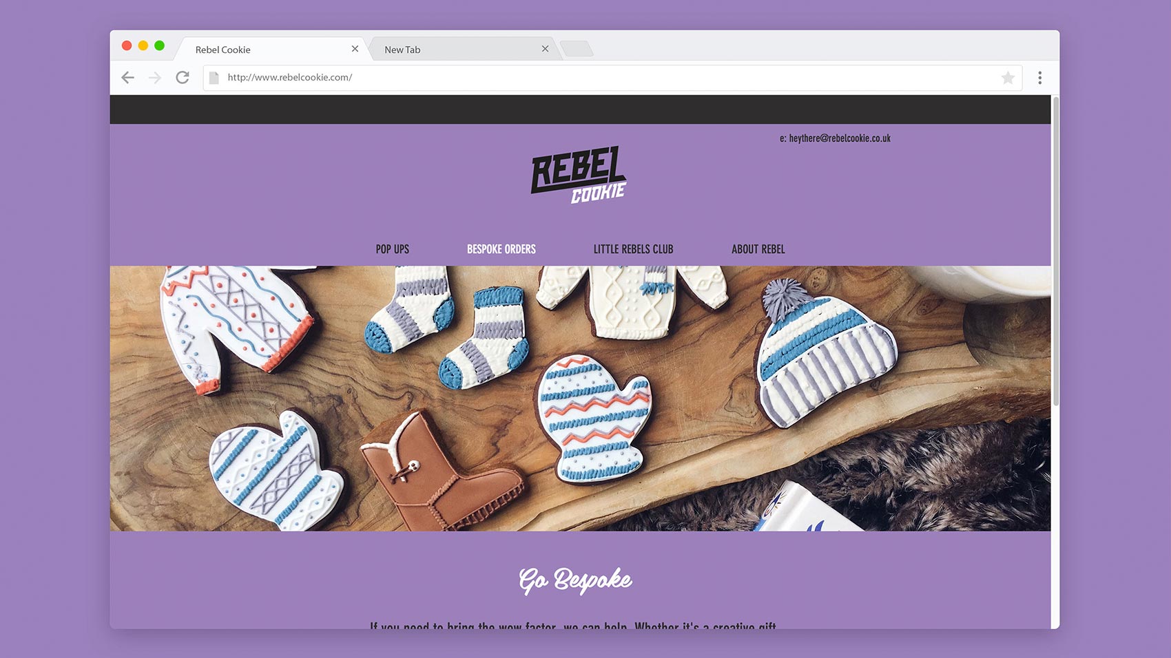
Rebel Cookie emerged as a disruptive force in the premium cookie market—combining unconventional flavor combinations with high-quality ingredients and bold attitude. Our mission was to create a brand identity that would stand out in the specialty food category and appeal to adventurous foodies seeking new taste experiences.

Two containers of coffee beans, featuring "REBEL COFFEE" labels with a sleek black and yellow design, showcase creative that converts—perfectly illustrating how a strategically‑led branding studio drives growth by design.
A fan of business cards with bold black, white, and yellow geometric patterns sits on a solid yellow background. Perfect for a strategically‑led branding studio focused on scalable growth strategies for start‑ups, each card features “REBEL ONLINE” in a modern font.

The specialty cookie market was becoming increasingly saturated with artisanal offerings, making it difficult for new entrants to gain attention. Rebel Cookie needed a distinctive brand identity that would immediately communicate its unconventional approach and capture the imagination of consumers seeking something beyond traditional cookie offerings. Additionally, the visual system had to work effectively across multiple touchpoints—from packaging to digital presence—while maintaining shelf impact in retail environments.

A website for Rebel Cookie is displayed on a browser. The homepage features biscuits shaped like jumpers, mittens, and boots with intricate patterns, set on a wooden surface—a playful showcase of Growth by Design. The purple background displays navigation links at the top.

We created a bold, playful identity anchored by a distinctive rebel character—a cookie with attitude, featuring a simple yet expressive face that conveys the brand’s personality. This character became the cornerstone of the brand, instantly recognizable and infinitely adaptable across applications. The colour palette rejected the expected earthy tones common in premium food brands, instead embracing vibrant colours—electric blue, hot pink, and bright yellow—contrasted against black backgrounds. This created immediate visual impact and reinforced the brand’s rebellious positioning. Typography combined a punchy, condensed sans-serif for headlines with a more readable companion for descriptive text, creating a hierarchy that balanced attitude with clarity. We developed a system of irreverent messaging and copywriting that infused personality throughout all brand communications. For packaging, we created a system that maintained consistency through structural and graphic elements while allowing each flavor variant to have its own distinct personality. Bold colour blocking and the rebel character ensured brand recognition from a distance, while close-up details rewarded examination with playful copy and graphic elements.

Rebel Cookie launched to significant market attention, achieving distribution in specialty food stores nationwide within six months. The distinctive packaging consistently performs well in shelf-impact testing, with 78% of surveyed consumers able to recognize the brand from five feet away—significantly higher than category averages. Social media engagement has been particularly strong, with the rebel character becoming a popular element in user-generated content. The brand has built a loyal following among the target demographic of 25-40 year old urban consumers who identify with its unconventional approach. Sales data indicates that Rebel Cookie has successfully carved out a premium position in the market, with customers willing to pay 30% above category average prices. The brand has received multiple packaging design awards and has been featured in several food and design publications as an example of effective disruptive branding.